A Brand Underserving Its Story
Serendiva is a luxury tea brand with a rich story to tell. When they came to us, the challenge was clear: their existing brand guide failed to reflect the premium quality they stood for, and it did not capture the Sri Lankan heritage at the heart of their identity. Our review uncovered additional issues — their logo had been set in a font free for personal use but not licensed for commercial purposes, and their typography relied on generic, free-to-use options that worked against the exclusivity they were trying to project.
Two Directions, Real Choices
We proposed two distinct brand directions to give Serendiva real choices. The first refined their existing visual language: elevated typography, stronger compositions, and a more confident use of their existing aesthetic. The second was a bolder overhaul, reimagining Serendiva as a shareable, story-driven luxury experience, weaving Sri Lankan culture and heritage into the identity through new illustration styles and a richer colour palette.
Guidance Beyond The Logo
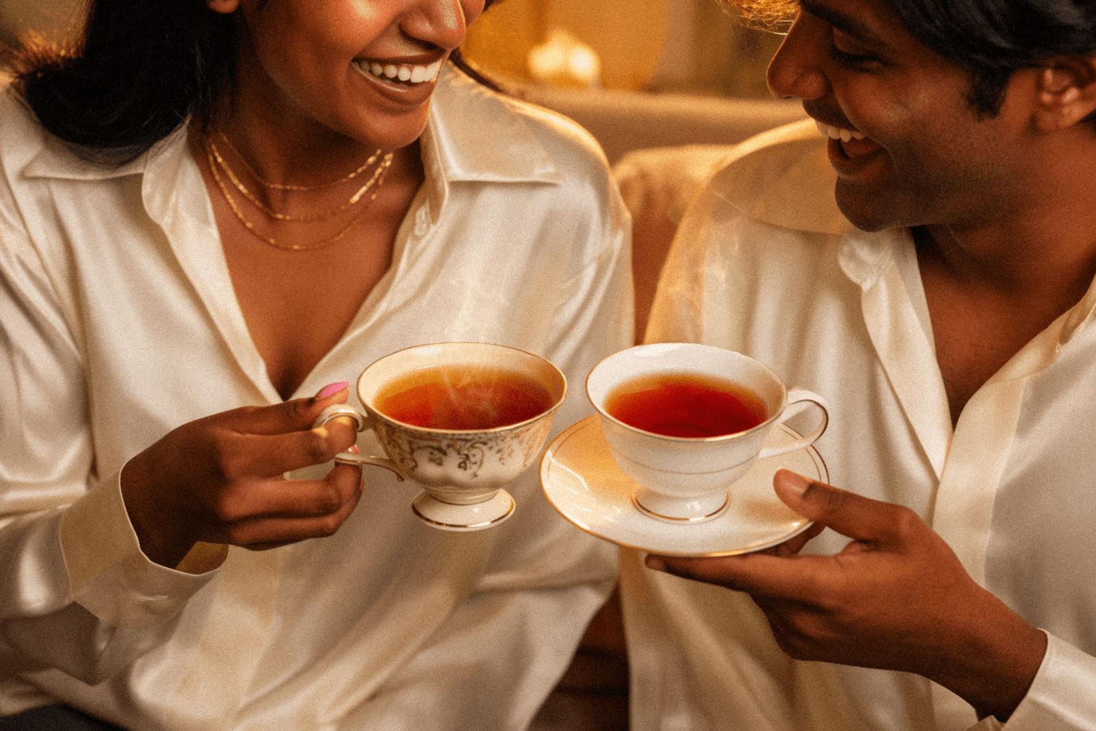
Alongside the identity work, we provided detailed photography and art direction guidance to ensure the brand could be brought to life consistently across packaging, editorial, and digital channels.
A Clear Path Forward
Serendiva received two fully developed brand directions, each with its own typographic system, packaging proposals, and illustration approach, giving them a clear path forward from a brand that had been technically unlicensed and visually misaligned. Both directions were received positively, with the bolder refresh generating particular excitement.